Visualization: Mapping Global Earthquake Activity
This project introduces the Basemap library, which can be used to create maps and plot geographical datasets.
Introduction
The main goal of this project is to help you get comfortable making maps of geographical data. If you follow along with the tutorial, you'll end up making this map:
It takes fewer than 50 lines of code to generate this map from a raw dataset! This project will conclude with a list of datasets to explore, to help you find a project of your own to try.
Inline output
The following code helps make all of the code samples in this notebook display their output properly. If you're running these programs as standalone Python programs, you don't need to worry about this code.
If you're using IPython Notebook for this work, you need this cell in your notebook. Also note that you need to run this cell before running any other cell in the notebook. Otherwise your output will display in a separate window, or it won't display at all. If you try to run a cell and the output does not display in the notebook:
- Restart the IPython Notebook kernel.
- Run the following cell.
- Run the cell you were interested in again.
# This just lets the output of the following code samples
#  display inline on this page, at an appropriate size.
from pylab import rcParams

%matplotlib inline
rcParams['figure.figsize'] = (8,6)
Installing matplotlib and Basemap
These instructions are written for Ubuntu first, and instructions specific to other operating systems will be added shortly.
Python’s matplotlib package is an amazing resource, and the Basemap toolkit extends matplotlib’s capabilities to mapping applications. Installing these packages is straightforward using Ubuntu’s package management system, but these packages may not work for all maps you want to produce. In that case, it is good to know how to install each package from source.
Using Miniconda to install matplotlib and Basemap
Conda is a package manager put out by the people at Continuum Analytics. The conda package installer makes it quite simple to install matplotlib and basemap. Be aware that if you're usuing virtualenv at all, conda can conflict with the way virtualenv works. But if you want to get into mapping, it's probably worthwhile to learn about conda.
Continuum Analytics puts out a distribution of Python called Anaconda, which includes a large set of packages that support data processing and scientific computing. We'll install Miniconda, which just installs the conda package manager; we'll then use conda to install the matplotlib and Basemap packages.
To install Miniconda, go to the Miniconda home page. Download and run the appropriate installer for your system. The following commands will get conda set up on a 32-bit Linux system:
~$ wget http://repo.continuum.io/miniconda/Miniconda3-latest-Linux-x86.sh
~$ bash Miniconda3-latest-Linux-x86.sh
~$   # Say yes to the prompt for prepending Miniconda3 install location to PATH
~$ exec bash
Create a conda environment
Once you've got conda installed, you'll use it to make an environment for this project. Make a directory for this project, and start a conda environment that includes matplotlib and basemap:
$ mkdir visualization_eq && cd visualization_eq
visualization_eq$ conda create -n eq_env python=3 matplotlib basemap pillow
visualization_eq$ source activate eq_env
(eq_env)visualization_eq$
The command conda create -n eq_env python=3 matplotlib basemap pillow does two things:
It creates an environment specific to this project, called
eq_env, which uses Python 3. conda will make sure any packages installed for this project don't interfere with packages installed for another project that conda manages.It checks to see if the packages we've listed,
matplotlib,basemap, andpillowhave already been installed by conda. If they have, conda will make them available in this environment. If they haven't been installed, conda will download and install the packages, and make them available in this environment. (pillowis an image-processing library)
Remembering to activate the environment
Any time you're going to work on this project, make sure you activate the environment with the command
visualization_eq$ source activate eq_env
(eq_env)visualization_eq$
This makes the packages associated with the environment available to any program you store in the directory visualization_eq.
Making a simple map
Let's start out by making a simple map of the world. If you run the following code, you should get a nice map of the globe, with good clean coastlines:
from mpl_toolkits.basemap import Basemap
import matplotlib.pyplot as plt
import numpy as np

# make sure the value of resolution is a lowercase L,
#  for 'low', not a numeral 1
my_map = Basemap(projection='ortho', lat_0=50, lon_0=-100,
              resolution='l', area_thresh=1000.0)

my_map.drawcoastlines()

plt.show()

Adding detail
Let’s add some more detail to this map, starting with country borders. Add the following lines after map.drawcoastlines():
from mpl_toolkits.basemap import Basemap
import matplotlib.pyplot as plt
import numpy as np

# make sure the value of resolution is a lowercase L,
#  for 'low', not a numeral 1
my_map = Basemap(projection='ortho', lat_0=50, lon_0=-100,
              resolution='l', area_thresh=1000.0)

my_map.drawcoastlines()
my_map.drawcountries()
my_map.fillcontinents(color='coral')

plt.show()

You should see the continents filled in. Now let’s clean up the edge of the globe:
from mpl_toolkits.basemap import Basemap
import matplotlib.pyplot as plt
import numpy as np

# make sure the value of resolution is a lowercase L,
#  for 'low', not a numeral 1
my_map = Basemap(projection='ortho', lat_0=50, lon_0=-100,
              resolution='l', area_thresh=1000.0)

my_map.drawcoastlines()
my_map.drawcountries()
my_map.fillcontinents(color='coral')
my_map.drawmapboundary()

plt.show()

You should see a cleaner circle outlining the globe. Now let’s draw latitude and longitude lines:
from mpl_toolkits.basemap import Basemap
import matplotlib.pyplot as plt
import numpy as np

# make sure the value of resolution is a lowercase L,
#  for 'low', not a numeral 1
my_map = Basemap(projection='ortho', lat_0=50, lon_0=-100,
              resolution='l', area_thresh=1000.0)

my_map.drawcoastlines()
my_map.drawcountries()
my_map.fillcontinents(color='coral')
my_map.drawmapboundary()

my_map.drawmeridians(np.arange(0, 360, 30))
my_map.drawparallels(np.arange(-90, 90, 30))

plt.show()

The np.arange() arguments tell where your latitude and longitude lines should begin and end, and how far apart they should be spaced.
Let’s play with two of the map settings, and then we'll move on to plotting data on this globe. Let’s start by adjusting the perspective. Change the latitude and longitude parameters in the original Basemap definition to 0 and -100. When you run the program, you should see your map centered along the equator:
from mpl_toolkits.basemap import Basemap
import matplotlib.pyplot as plt
import numpy as np

# make sure the value of resolution is a lowercase L,
#  for 'low', not a numeral 1
my_map = Basemap(projection='ortho', lat_0=0, lon_0=-100,
              resolution='l', area_thresh=1000.0)

my_map.drawcoastlines()
my_map.drawcountries()
my_map.fillcontinents(color='coral')
my_map.drawmapboundary()

my_map.drawmeridians(np.arange(0, 360, 30))
my_map.drawparallels(np.arange(-90, 90, 30))

plt.show()

Now let’s change the kind of map we're producing. Change the projection type to ‘robin’. You should end up with a Robinson projection instead of a globe:
from mpl_toolkits.basemap import Basemap
import matplotlib.pyplot as plt
import numpy as np

# make sure the value of resolution is a lowercase L,
#  for 'low', not a numeral 1
my_map = Basemap(projection='robin', lat_0=0, lon_0=-100,
              resolution='l', area_thresh=1000.0)

my_map.drawcoastlines()
my_map.drawcountries()
my_map.fillcontinents(color='coral')
my_map.drawmapboundary()

my_map.drawmeridians(np.arange(0, 360, 30))
my_map.drawparallels(np.arange(-90, 90, 30))

plt.show()

Zooming in
Before we move on to plotting points on the map, let’s see how to zoom in on a region. This is good to know because there are many data sets specific to one region of the world, which would get lost when plotted on a map of the whole world. Some projections can not be zoomed in at all, so if things are not working well, make sure to look at the documentation.
I live on Baranof Island in southeast Alaska, so let’s zoom in on that region. One way to zoom in is to specify the latitude and longitude of the lower left and upper right corners of the region you want to show. Let’s use a mercator projection, which supports this method of zooming. The notation for “lower left corner at 136.25 degrees west and 56 degrees north” is:
llcrnrlon = -136.25, llcrnrlat = 56.0
So, the full set of parameters we'll try is:
from mpl_toolkits.basemap import Basemap
import matplotlib.pyplot as plt
import numpy as np

# make sure the value of resolution is a lowercase L,
#  for 'low', not a numeral 1
my_map = Basemap(projection='merc', lat_0=57, lon_0=-135,
    resolution = 'l', area_thresh = 1000.0,
    llcrnrlon=-136.25, llcrnrlat=56,
    urcrnrlon=-134.25, urcrnrlat=57.75)

my_map.drawcoastlines()
my_map.drawcountries()
my_map.fillcontinents(color='coral')
my_map.drawmapboundary()

my_map.drawmeridians(np.arange(0, 360, 30))
my_map.drawparallels(np.arange(-90, 90, 30))

plt.show()

Note that the center of the map, given by lat_0 and lon_0, must be within the region you are zoomed in on.
This worked, but the map is pretty ugly. We're missing an entire island to the west of here! Let’s change the resolution to ‘h’ for ‘high’, and see what we get:
from mpl_toolkits.basemap import Basemap
import matplotlib.pyplot as plt
import numpy as np

# make sure the value of resolution is a lowercase L,
#  for 'low', not a numeral 1
my_map = Basemap(projection='merc', lat_0=57, lon_0=-135,
    resolution = 'h', area_thresh = 1000.0,
    llcrnrlon=-136.25, llcrnrlat=56,
    urcrnrlon=-134.25, urcrnrlat=57.75)

my_map.drawcoastlines()
my_map.drawcountries()
my_map.fillcontinents(color='coral')
my_map.drawmapboundary()

my_map.drawmeridians(np.arange(0, 360, 30))
my_map.drawparallels(np.arange(-90, 90, 30))

plt.show()

This is much better, but we're still missing an entire island to the west. This is because of the area_thresh setting. This setting specifies how large a feature must be in order to appear on the map. The current setting will only show features larger than 1000 square kilometers. This is a reasonable setting for a low-resolution map of the world, but it's a really bad choice for a small-scale map. Let’s change that setting to 0.1, and see how much detail we get:
from mpl_toolkits.basemap import Basemap
import matplotlib.pyplot as plt
import numpy as np

# make sure the value of resolution is a lowercase L,
#  for 'low', not a numeral 1
my_map = Basemap(projection='merc', lat_0=57, lon_0=-135,
    resolution = 'h', area_thresh = 0.1,
    llcrnrlon=-136.25, llcrnrlat=56,
    urcrnrlon=-134.25, urcrnrlat=57.75)

my_map.drawcoastlines()
my_map.drawcountries()
my_map.fillcontinents(color='coral')
my_map.drawmapboundary()

my_map.drawmeridians(np.arange(0, 360, 30))
my_map.drawparallels(np.arange(-90, 90, 30))

plt.show()

This is now a meaningful map. We can see Kruzof island, the large island to the west of Baranof, and many other islands in the area. Settings lower than area_thresh=0.1 won't add any new details at this level of zoom.
Basemap is an incredibly flexible package. If you're curious to play around with other settings, take a look at the Basemap documentation. Next, we'll learn how to plot points on our maps.
Plotting points on a simple map
It's a testament to the hard work of many other people that we can create a map like the one above in less than 15 lines of code! Now let’s add some points to the map. I live in Sitka, the largest community on Baranof Island, so let’s add a point showing Sitka’s location. Add the following lines just before plt.show():
from mpl_toolkits.basemap import Basemap
import matplotlib.pyplot as plt
import numpy as np

my_map = Basemap(projection='merc', lat_0 = 57, lon_0 = -135,
    resolution = 'h', area_thresh = 0.1,
    llcrnrlon=-136.25, llcrnrlat=56.0,
    urcrnrlon=-134.25, urcrnrlat=57.75)

my_map.drawcoastlines()
my_map.drawcountries()
my_map.fillcontinents(color = 'coral')
my_map.drawmapboundary()

lon = -135.3318
lat = 57.0799
x,y = my_map(lon, lat)
my_map.plot(x, y, 'bo', markersize=12)

plt.show()

The only non-obvious line here is the bo argument, which tells basemap to use a blue circle for the point. There are quite a number of colors and symbols you can use. For more choices, see the documentation for the matplotlib.pyplot.plot function. The default marker size is 6, but that was too small on this particular map. A markersize of 12 shows up nicely on this map.
Plotting a single point is nice, but we often want to plot a large set of points on a map. There are two other communities on Baranof Island, so let’s show where those two communities are on this map. We store the latitudes and longitudes of our points in two separate lists, map those to x and y coordinates, and plot those points on the map. With more dots on the map, we also want to reduce the marker size slightly:
from mpl_toolkits.basemap import Basemap
import matplotlib.pyplot as plt
import numpy as np

my_map = Basemap(projection='merc', lat_0 = 57, lon_0 = -135,
    resolution = 'h', area_thresh = 0.1,
    llcrnrlon=-136.25, llcrnrlat=56.0,
    urcrnrlon=-134.25, urcrnrlat=57.75)

my_map.drawcoastlines()
my_map.drawcountries()
my_map.fillcontinents(color = 'coral')
my_map.drawmapboundary()

lons = [-135.3318, -134.8331, -134.6572]
lats = [57.0799, 57.0894, 56.2399]
x,y = my_map(lons, lats)
my_map.plot(x, y, 'bo', markersize=10)

plt.show()

Labeling points
Now let’s label these three points. We make a list of our labels, and loop through that list. We need to include the x and y values for each point in this loop, so Basemap can figure out where to place each label.
from mpl_toolkits.basemap import Basemap
import matplotlib.pyplot as plt
import numpy as np

my_map = Basemap(projection='merc', lat_0 = 57, lon_0 = -135,
    resolution = 'h', area_thresh = 0.1,
    llcrnrlon=-136.25, llcrnrlat=56.0,
    urcrnrlon=-134.25, urcrnrlat=57.75)

my_map.drawcoastlines()
my_map.drawcountries()
my_map.fillcontinents(color = 'coral')
my_map.drawmapboundary()

lons = [-135.3318, -134.8331, -134.6572]
lats = [57.0799, 57.0894, 56.2399]
x,y = my_map(lons, lats)
my_map.plot(x, y, 'bo', markersize=10)

labels = ['Sitka', 'Baranof Warm Springs', 'Port Alexander']
for label, xpt, ypt in zip(labels, x, y):
    plt.text(xpt, ypt, label)

plt.show()

Our towns are now labeled, but the labels start right on top of the points. We can add offsets to these points, so they aren't right on top of the points. Let’s move all of the labels a little up and to the right. (If you're curious, these offsets are in map projection coordinates, which are measured in meters. This means our code actually places the labels 10 km to the east and 5 km to the north of the actual townsites.)
from mpl_toolkits.basemap import Basemap
import matplotlib.pyplot as plt
import numpy as np

my_map = Basemap(projection='merc', lat_0 = 57, lon_0 = -135,
    resolution = 'h', area_thresh = 0.1,
    llcrnrlon=-136.25, llcrnrlat=56.0,
    urcrnrlon=-134.25, urcrnrlat=57.75)

my_map.drawcoastlines()
my_map.drawcountries()
my_map.fillcontinents(color = 'coral')
my_map.drawmapboundary()

lons = [-135.3318, -134.8331, -134.6572]
lats = [57.0799, 57.0894, 56.2399]
x,y = my_map(lons, lats)
my_map.plot(x, y, 'bo', markersize=10)

labels = ['Sitka', 'Baranof Warm Springs', 'Port Alexander']
for label, xpt, ypt in zip(labels, x, y):
    plt.text(xpt+10000, ypt+5000, label)

plt.show()

This is better, but on a map of this scale the same offset doesn't work well for all points. We could plot each label individually, but it's easier to make two lists to store our offsets:
from mpl_toolkits.basemap import Basemap
import matplotlib.pyplot as plt
import numpy as np

my_map = Basemap(projection='merc', lat_0 = 57, lon_0 = -135,
    resolution = 'h', area_thresh = 0.1,
    llcrnrlon=-136.25, llcrnrlat=56.0,
    urcrnrlon=-134.25, urcrnrlat=57.75)

my_map.drawcoastlines()
my_map.drawcountries()
my_map.fillcontinents(color = 'coral')
my_map.drawmapboundary()

lons = [-135.3318, -134.8331, -134.6572]
lats = [57.0799, 57.0894, 56.2399]
x,y = my_map(lons, lats)
my_map.plot(x, y, 'bo', markersize=10)

labels = ['Sitka', 'Baranof\n  Warm Springs', 'Port Alexander']
x_offsets = [10000, -20000, -25000]
y_offsets = [5000, -50000, -35000]

for label, xpt, ypt, x_offset, y_offset in zip(labels, x, y, x_offsets, y_offsets):
    plt.text(xpt+x_offset, ypt+y_offset, label)

plt.show()

There's no easy way to keep “Baranof Warm Springs” from crossing a border, but the use of newlines within a label makes it a little more legible. Now that we know how to add points to a map, we can move on to larger data sets.
A global earthquake dataset
The US government maintains a set of live feeds of earthquake-related data from recent seismic events. You can choose to examine data from the last hour, through the last thirty days. You can choose to examine data from events that have a variety of magnitudes. For this project, we'll use a dataset that contains all seismic events over the last seven days, which have a magnitude of 1.0 or greater.
You can also choose from a variety of formats. In this first example, we'll look at how to parse a file in the csv format (comma-separated value). There are more convenient formats to work with such as json, but not all data sets are neatly organized. We'll start out parsing a csv file, and then perhaps take a look at how to work with the json format.
To follow this project on your own system, go to the USGS source for csv files of earthquake data and download the file "M1.0+ Earthquakes" under the "Past 7 Days" header. If you like, here is a direct link to that file. This data is updated every 5 minutes, so your data won't match what you see here exactly. The format should match, but the data itself won't match.
Parsing the data
If we examine the first few lines of the text file of the dataset, we can identify the information that's most relevant to us:
time,latitude,longitude,depth,mag,magType,nst,gap,dmin,rms,net,id,updated,place,type
2015-04-25T14:25:06.520Z,40.6044998,-121.8546677,17.65,1.92,md,7,172,0.0806,0.02,nc,nc72435025,2015-04-25T14:31:51.640Z,"12km NNE of Shingletown, California",earthquake
2015-04-25T14:21:16.420Z,37.6588326,-122.5056686,7.39,2.02,md,21,99,0.07232,0.04,nc,nc72435020,2015-04-25T14:26:05.693Z,"3km SSW of Broadmoor, California",earthquake
2015-04-25T14:14:40.000Z,62.6036,-147.6845,43.1,1.7,ml,,,,0.67,ak,ak11565061,2015-04-25T14:40:18.782Z,"108km NNE of Sutton-Alpine, Alaska",earthquake
2015-04-25T14:10:02.830Z,27.5843,85.6622,10,4.6,mb,,86,5.898,0.87,us,us20002965,2015-04-25T14:38:25.174Z,"14km E of Panaoti, Nepal",earthquake
2015-04-25T13:55:47.040Z,33.0888333,-116.0531667,5.354,1.09,ml,23,38,0.1954,0.26,ci,ci37151511,2015-04-25T13:59:57.204Z,"10km SE of Ocotillo Wells, California",earthquake
For now, we're only interested in the latitude and longitude of each earthquake. If we look at the first line, it looks like we're interested in the second and third columns of each line. In the directory where you save your program files, make a directory called “datasets”. Save the text file as “earthquake_data.csv” in this new directory.
Using Python's csv module to parse the data
We'll process the data using Python's csv module module, which simplifies the process of working with csv files.
The following code produces two lists, containing the latitudes and longitudes of each earthquake in the file:
import csv

# Open the earthquake data file.
filename = 'datasets/earthquake_data.csv'

# Create empty lists for the latitudes and longitudes.
lats, lons = [], []

# Read through the entire file, skip the first line,
#  and pull out just the lats and lons.
with open(filename) as f:
    # Create a csv reader object.
    reader = csv.reader(f)

    # Ignore the header row.
    next(reader)

    # Store the latitudes and longitudes in the appropriate lists.
    for row in reader:
        lats.append(float(row[1]))
        lons.append(float(row[2]))

# Display the first 5 lats and lons.
print('lats', lats[0:5])
print('lons', lons[0:5])
We create empty lists to contain the latitudes and longitudes. Then we use the with statement to ensure that the file closes properly once it has been read, even if there are errors in processing the file.
With the data file open, we initialize a csv reader object. The next() function skips over the header row. Then we loop through each row in the data file, and pull out the information we want.
Plotting earthquakes
Using what we learned about plotting a set of points, we can now make a simple plot of these points:
import csv

# Open the earthquake data file.
filename = 'datasets/earthquake_data.csv'

# Create empty lists for the latitudes and longitudes.
lats, lons = [], []

# Read through the entire file, skip the first line,
#  and pull out just the lats and lons.
with open(filename) as f:
    # Create a csv reader object.
    reader = csv.reader(f)

    # Ignore the header row.
    next(reader)

    # Store the latitudes and longitudes in the appropriate lists.
    for row in reader:
        lats.append(float(row[1]))
        lons.append(float(row[2]))

# --- Build Map ---
from mpl_toolkits.basemap import Basemap
import matplotlib.pyplot as plt
import numpy as np

eq_map = Basemap(projection='robin', resolution = 'l', area_thresh = 1000.0,
              lat_0=0, lon_0=-130)
eq_map.drawcoastlines()
eq_map.drawcountries()
eq_map.fillcontinents(color = 'gray')
eq_map.drawmapboundary()
eq_map.drawmeridians(np.arange(0, 360, 30))
eq_map.drawparallels(np.arange(-90, 90, 30))

x,y = eq_map(lons, lats)
eq_map.plot(x, y, 'ro', markersize=6)

plt.show()

This is pretty cool; in about 40 lines of code we've turned a giant text file into an informative map. But there's one fairly obvious improvement we should make - let’s try to make the points on the map represent the magnitude of each earthquake. We start out by reading the magnitudes into a list along with the latitudes and longitudes of each earthquake:
import csv

# Open the earthquake data file.
filename = 'datasets/earthquake_data.csv'

# Create empty lists for the data we are interested in.
lats, lons = [], []
magnitudes = []

# Read through the entire file, skip the first line,
#  and pull out just the lats and lons.
with open(filename) as f:
    # Create a csv reader object.
    reader = csv.reader(f)

    # Ignore the header row.
    next(reader)

    # Store the latitudes and longitudes in the appropriate lists.
    for row in reader:
        lats.append(float(row[1]))
        lons.append(float(row[2]))
        magnitudes.append(float(row[4]))

# --- Build Map ---
from mpl_toolkits.basemap import Basemap
import matplotlib.pyplot as plt
import numpy as np

eq_map = Basemap(projection='robin', resolution = 'l', area_thresh = 1000.0,
              lat_0=0, lon_0=-130)
eq_map.drawcoastlines()
eq_map.drawcountries()
eq_map.fillcontinents(color = 'gray')
eq_map.drawmapboundary()
eq_map.drawmeridians(np.arange(0, 360, 30))
eq_map.drawparallels(np.arange(-90, 90, 30))

x,y = eq_map(lons, lats)
eq_map.plot(x, y, 'ro', markersize=6)

plt.show()
Now instead of plotting all the points at once, we'll loop through the points and plot them one at a time. When we plot each point, we'll adjust the dot size according to the magnitude. Since the magnitudes start at 1.0, we can simply use the magnitude as a scale factor. To get the marker size, we just multiply the magnitude by the smallest dot we want on our map:
import csv

# Open the earthquake data file.
filename = 'datasets/earthquake_data.csv'

# Create empty lists for the data we are interested in.
lats, lons = [], []
magnitudes = []

# Read through the entire file, skip the first line,
#  and pull out just the lats and lons.
with open(filename) as f:
    # Create a csv reader object.
    reader = csv.reader(f)

    # Ignore the header row.
    next(reader)

    # Store the latitudes and longitudes in the appropriate lists.
    for row in reader:
        lats.append(float(row[1]))
        lons.append(float(row[2]))
        magnitudes.append(float(row[4]))

# --- Build Map ---
from mpl_toolkits.basemap import Basemap
import matplotlib.pyplot as plt
import numpy as np

eq_map = Basemap(projection='robin', resolution = 'l', area_thresh = 1000.0,
              lat_0=0, lon_0=-130)
eq_map.drawcoastlines()
eq_map.drawcountries()
eq_map.fillcontinents(color = 'gray')
eq_map.drawmapboundary()
eq_map.drawmeridians(np.arange(0, 360, 30))
eq_map.drawparallels(np.arange(-90, 90, 30))

min_marker_size = 2.5
for lon, lat, mag in zip(lons, lats, magnitudes):
    x,y = eq_map(lon, lat)
    msize = mag * min_marker_size
    eq_map.plot(x, y, 'ro', markersize=msize)

plt.show()

We define our minimum marker size and then loop through all the data points, calculating the marker size for each point by multiplying the magnitude of the earthquake by the minimum marker size.
If you haven't used the zip() function before, it takes a number of lists, and pulls one item from each list. On each loop iteration, we have a matching set of longitude, latitude, and magnitude of each earthquake.
Adding color
There's one more change we can make, to generate a more meaningful visualization. Let’s use some different colors to represent the magnitudes as well. Let's make small earthquakes green, moderate earthquakes yellow, and significant earthquakes red. The following version includes a function that identifies the appropriate color for each earthquake:
import csv

# Open the earthquake data file.
filename = 'datasets/earthquake_data.csv'

# Create empty lists for the data we are interested in.
lats, lons = [], []
magnitudes = []

# Read through the entire file, skip the first line,
#  and pull out just the lats and lons.
with open(filename) as f:
    # Create a csv reader object.
    reader = csv.reader(f)

    # Ignore the header row.
    next(reader)

    # Store the latitudes and longitudes in the appropriate lists.
    for row in reader:
        lats.append(float(row[1]))
        lons.append(float(row[2]))
        magnitudes.append(float(row[4]))

# --- Build Map ---
from mpl_toolkits.basemap import Basemap
import matplotlib.pyplot as plt
import numpy as np

def get_marker_color(magnitude):
    # Returns green for small earthquakes, yellow for moderate
    #  earthquakes, and red for significant earthquakes.
    if magnitude < 3.0:
        return ('go')
    elif magnitude < 5.0:
        return ('yo')
    else:
        return ('ro')

eq_map = Basemap(projection='robin', resolution = 'l', area_thresh = 1000.0,
              lat_0=0, lon_0=-130)
eq_map.drawcoastlines()
eq_map.drawcountries()
eq_map.fillcontinents(color = 'gray')
eq_map.drawmapboundary()
eq_map.drawmeridians(np.arange(0, 360, 30))
eq_map.drawparallels(np.arange(-90, 90, 30))

min_marker_size = 2.5
for lon, lat, mag in zip(lons, lats, magnitudes):
    x,y = eq_map(lon, lat)
    msize = mag * min_marker_size
    marker_string = get_marker_color(mag)
    eq_map.plot(x, y, marker_string, markersize=msize)

plt.show()

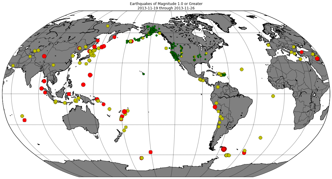
Now we can easily see where the most significant earthquakes are happening.
Adding a title
Before we finish, let’s add a title to our map. Our title needs to include the date range for these earthquakes, which requires us to pull in a little more data when we parse the raw text. To make the title, we'll use the dates of the first and last earthquakes. Since the file includes the most recent earthquakes first, we need to use the last items as the starting date:
import csv

# Open the earthquake data file.
filename = 'datasets/earthquake_data.csv'

# Create empty lists for the data we are interested in.
lats, lons = [], []
magnitudes = []
timestrings = []

# Read through the entire file, skip the first line,
#  and pull out just the lats and lons.
with open(filename) as f:
    # Create a csv reader object.
    reader = csv.reader(f)

    # Ignore the header row.
    next(reader)

    # Store the latitudes and longitudes in the appropriate lists.
    for row in reader:
        lats.append(float(row[1]))
        lons.append(float(row[2]))
        magnitudes.append(float(row[4]))
        timestrings.append(row[0])

# --- Build Map ---
from mpl_toolkits.basemap import Basemap
import matplotlib.pyplot as plt
import numpy as np

def get_marker_color(magnitude):
    # Returns green for small earthquakes, yellow for moderate
    #  earthquakes, and red for significant earthquakes.
    if magnitude < 3.0:
        return ('go')
    elif magnitude < 5.0:
        return ('yo')
    else:
        return ('ro')

eq_map = Basemap(projection='robin', resolution = 'l', area_thresh = 1000.0,
              lat_0=0, lon_0=-130)
eq_map.drawcoastlines()
eq_map.drawcountries()
eq_map.fillcontinents(color = 'gray')
eq_map.drawmapboundary()
eq_map.drawmeridians(np.arange(0, 360, 30))
eq_map.drawparallels(np.arange(-90, 90, 30))

min_marker_size = 2.5
for lon, lat, mag in zip(lons, lats, magnitudes):
    x,y = eq_map(lon, lat)
    msize = mag * min_marker_size
    marker_string = get_marker_color(mag)
    eq_map.plot(x, y, marker_string, markersize=msize)

title_string = "Earthquakes of Magnitude 1.0 or Greater\n"
title_string += "%s through %s" % (timestrings[-1], timestrings[0])
plt.title(title_string)

plt.show()

This is good, but the time zone format makes the title a little harder to read. Let's just use the dates, and ignore the times in our title. We can do this by keeping the first 10 characters of each timestring, using a slice: timestring[:10]. Since this is the final iteration for this project, let's also make the plot size larger as well:
import csv

# Open the earthquake data file.
filename = 'datasets/earthquake_data.csv'

# Create empty lists for the data we are interested in.
lats, lons = [], []
magnitudes = []
timestrings = []

# Read through the entire file, skip the first line,
#  and pull out just the lats and lons.
with open(filename) as f:
    # Create a csv reader object.
    reader = csv.reader(f)

    # Ignore the header row.
    next(reader)

    # Store the latitudes and longitudes in the appropriate lists.
    for row in reader:
        lats.append(float(row[1]))
        lons.append(float(row[2]))
        magnitudes.append(float(row[4]))
        timestrings.append(row[0])

# --- Build Map ---
from mpl_toolkits.basemap import Basemap
import matplotlib.pyplot as plt
import numpy as np

def get_marker_color(magnitude):
    # Returns green for small earthquakes, yellow for moderate
    #  earthquakes, and red for significant earthquakes.
    if magnitude < 3.0:
        return ('go')
    elif magnitude < 5.0:
        return ('yo')
    else:
        return ('ro')

# Make this plot larger.
plt.figure(figsize=(16,12))

eq_map = Basemap(projection='robin', resolution = 'l', area_thresh = 1000.0,
              lat_0=0, lon_0=-130)
eq_map.drawcoastlines()
eq_map.drawcountries()
eq_map.fillcontinents(color = 'gray')
eq_map.drawmapboundary()
eq_map.drawmeridians(np.arange(0, 360, 30))
eq_map.drawparallels(np.arange(-90, 90, 30))

min_marker_size = 2.5
for lon, lat, mag in zip(lons, lats, magnitudes):
    x,y = eq_map(lon, lat)
    msize = mag * min_marker_size
    marker_string = get_marker_color(mag)
    eq_map.plot(x, y, marker_string, markersize=msize)

title_string = "Earthquakes of Magnitude 1.0 or Greater\n"
title_string += "%s through %s" % (timestrings[-1][:10], timestrings[0][:10])
plt.title(title_string)

plt.show()

To get a sense of how flexible the basemap library is, check out how quickly you can change the look and feel of this map. Comment out the line that colors the continents, and replace it with a call to bluemarble. You might want to adjust min_marker_size as well, if you make this map on your own system:
import csv

# Open the earthquake data file.
filename = 'datasets/earthquake_data.csv'

# Create empty lists for the data we are interested in.
lats, lons = [], []
magnitudes = []
timestrings = []

# Read through the entire file, skip the first line,
#  and pull out just the lats and lons.
with open(filename) as f:
    # Create a csv reader object.
    reader = csv.reader(f)

    # Ignore the header row.
    next(reader)

    # Store the latitudes and longitudes in the appropriate lists.
    for row in reader:
        lats.append(float(row[1]))
        lons.append(float(row[2]))
        magnitudes.append(float(row[4]))
        timestrings.append(row[0])

# --- Build Map ---
from mpl_toolkits.basemap import Basemap
import matplotlib.pyplot as plt
import numpy as np

def get_marker_color(magnitude):
    # Returns green for small earthquakes, yellow for moderate
    #  earthquakes, and red for significant earthquakes.
    if magnitude < 3.0:
        return ('go')
    elif magnitude < 5.0:
        return ('yo')
    else:
        return ('ro')

eq_map = Basemap(projection='robin', resolution = 'l', area_thresh = 1000.0,
              lat_0=0, lon_0=-130)
eq_map.drawcoastlines()
eq_map.drawcountries()
#eq_map.fillcontinents(color = 'gray')
eq_map.bluemarble()
eq_map.drawmapboundary()
eq_map.drawmeridians(np.arange(0, 360, 30))
eq_map.drawparallels(np.arange(-90, 90, 30))

min_marker_size = 2.25
for lon, lat, mag in zip(lons, lats, magnitudes):
    x,y = eq_map(lon, lat)
    msize = mag * min_marker_size
    marker_string = get_marker_color(mag)
    eq_map.plot(x, y, marker_string, markersize=msize)

title_string = "Earthquakes of Magnitude 1.0 or Greater\n"
title_string += "%s through %s" % (timestrings[-1][:10], timestrings[0][:10])
plt.title(title_string)

plt.show()

We could continue to refine this map. For example, we could read the data from the url instead of from a downloaded text file. That way the map would always be current. We could determine each dot’s color on a continuous scale of greens, yellows, and reds. Now that you have a better sense of how to work with basemap, I hope you enjoy playing with these further refinements as you map the datasets you're most interested in.
Other interesting datasets to explore
In this project, you learned how to make a simple map and plot points on that map. You learned how to pull those points from a large dataset. Now that you have a basic understanding of this process, the next step is to try your hand at plotting some data of your own. You might start by exploring some of the following datasets.
Global Population data
This dataset ties global census data to latitude and longitude grids.
http://daac.ornl.gov/ISLSCP_II/guides/global_population_xdeg.html
Climate Data library
This includes over 300 data files, from a variety of fields related to earth science and climatology.
http://iridl.ldeo.columbia.edu/
USGov Raw Data
This is another large set of datasets, about a variety of topics. This is where I found the data for the earthquake visualization featured in the tutorial.
https://explore.data.gov/catalog/raw/
Hilary Mason’s Research-Quality Datasets
Hilary Mason is a data scientist at bitly. If you have never heard of her, it's well worth your time to take a look at her site. If you are new to data science, you might want to start with here post Getting Started with Data Science. She has a curated collection of interesting datasets here:
http://bitly.com/bundles/hmason/1
DEA Meth Lab database
This would be a little harder to work with, because the locations are given as addresses instead of by latitude and longitude. It is also released in pdf format, which might be more challenging to work with. But this is a pretty compelling topic, and it would be interesting to map out meth-related arrests and incidents of violent crime over different periods of time.
http://www.justice.gov/dea/clan-lab/clan-lab.shtml
Other
Smart Disclosure Data:
http://www.data.gov/consumer/page/consumer-data-page